
Sustie.io
Shopping sustainably has never been easier.
🛼 Role
UX/UI Designer
🎯 Skills
Sketching, Wireframes, Visual Design, UX Research, UX Writing, Collaboration
🛠️ Tools
Figma, Zoom, Slack
⏳ Year
2023
🗓️ Duration
4 Weeks
Problem
Shoppers want to support companies that use sustainable manufacturing processes to make clothing, but it is difficult to tell fact from fiction when it comes to how companies present themselves.
Solution
A multipurpose display card that lets shoppers see Sustie’s evidence based sustainability metrics, as well as how the company works to offset the carbon footprint of your purchase.
What, and who, is sustie?
Sustie aims to help consumers make the most sustainable clothing choices by aggregating and synthesizing data from fashion manufacturers. Sustie also provides shoppers with the opportunity to offset the carbon emissions of their purchase by collaborating with partner companies dedicated to environmental causes such as planting trees and cleaning up plastic waste.

Missions and values
Honesty: “We always tell the truth with our users, our community and among ourselves. Providing trustworthy information is core to who we are.”
Passion: “We are a fiery bunch. We are not here because it is work but because we believe in what we are doing and the revolution that will come from Sustie!”
Bravery: “We try and we fail but we always try! We belive in taking leaps of faith even when it may not be logical. We make the impossible possible.”
Project Goals

Our first meeting with the Sustie team was focused on defining our goals and expectations going into this project.

Brief
Design an interface that displays Sustie’s sustainability metrics on a given e-commerce product page, as well as options to offset carbon emissions via Sustie’s partner organizations. Design additional interfaces for post-purchase follow up if time allows.
Needs
Product card (Primary goal)
Post purchase card
Post purchase email
Follow up email
Copy for all of the above
Given
We were given the brand’s existing tone and style guides on which to base our design and copy writing decisions. We also were given the existing product card and email template, and a list of partnered clothing brands and environmental organizations.
Consumer Survey

Key Takeaways
Even eco-concious consumers consider price and quality first.
Trust in the health and environmental claims made by corporations are low.
Higher quality products are seen as inherently more sustainable, since they (ideally) last longer.
The research team collected 83 responses from a variety of online and in-person sources. The vast majority of respondents indicated that they valued at least some metrics for sustainability. However, a large number stated that while sustainability is important, it is less important to them than purchasing goods that are high quality and affordable.

“I think quality is a really important factor because a high quality product you have forever is more sustainable than a disposable product.”
“Sustainability cannot come at the cost of practicality—if it’s not functional and it’s not in my price range, I won’t buy sustainable items.”
“I try to find a good middle ground of cost/quality, and sustainability is a big bonus and can sway my mind in terms of cost.”
Business Interviews

Our research team reached out to the owners of three brands who either are already using the Sustie app or who have plans to in the near future. All three provided valuable insights about how their business needs could be better met by the app, but many of the core takeaways were the same: Businesses want a web app that is adaptable, that puts their best qualities on display, and that fosters trust with their customer base. Combining this with insights from the consumer survey, the team generated additional insights on features that may be needed and unneeded in the card.
Key Takeaways
The card must be able to fit the aesthetic of any site it’s featured on. Neutral design and customization (technology allowing) are musts.
Many clothing companies have more features that make them appealing to eco-conscious consumers than they even realize, and are rarely able to display the full extent of their offerings. The product card could provide a chance to show off features like their sturdy materials and ethical chains of production.
As it stands, most ethical and environmental claims made by companies are too difficult for consumers to verify on their own. A product card that gives easily-investigated citations for data would go a long way towards fostering trust.
Heuristic Evaluation


The UI design team started by looking critically at the design qualities of the original widget: hierarchy, contrast, white space, and more. Was any information missing? Was any unnecessary? Was it phrased as effectively as it could be? Using Jakob Nielsen’s 10 usability heuristics, we identified three key areas of improvement.
Aesthetic and Minimalist design:
Issues: The cards have simple, adaptable color palettes, but they feel a bit crowded and lack a strong visual hierarchy.
Recommendations: Explore different layouts and typographic solutions, rework illustrations for simplicity and consistency.
Match Between the System and Real World
Issues: Copy is slightly awkward and wordy, and the information displayed may not correspond to what climate conscious consumers actually look for in an item.
Recommendations: Conduct user research to better understand the needs and thought processes of customers, and the kind of language that they use surrounding their shopping habits.
Visibility of System Status
Issues: The card currently appears as a static image file, which displays data collected by Sustie’s proprietary software. It provides little context for where this data comes from, and lacks interactive elements.
Recommendations: A loading screen may make the data feel like it is being loaded from an external source, which ideally it is. Embedded links to information about Sustie and its partners may also increase trust and give more context to the card’s claims.
User Flow

With the brand guidelines and survey in mind, the team then had to decide which parts of the Sustie user flow to focus on.
In discussions with stakeholders, we found that the greatest opportunities for redesign were in the middle of the user flow, and that the focus should be on driving conversions on the e-commerce sites themselves. However we also found opportunities for improvement in the post-purchase experience, particularly following up on the climate actions taken on customers’ behalf.
Sketches and Wireframes
The design team started the design process by sketching out some variations on the existing product card, as well as ideas for post purchase screens including ways to check on the progress of the climate action.


Digital Iterations

The design team began to iterate on our sketches and the existing card, experimenting with illustrations, colors, and copy. Referring back to our primary user persona and her focus on quality and value, we looked for ways to display these metrics without compromising the data around which Sustie’s core offering revolves.
We explored ways to display additional sustainability metrics that our survey indicated were most important to consumers: Materials (high quality, environmentally friendly) and production (Fair Trade, local, etc).
Stakeholder Review


After several rounds of iterations within the design team, we consulted our stakeholders to determine if our work was headed in a good direction. These were their critiques:
Structure: Stakeholders liked the idea of the “material and production” sections, but said that the floating cards would be unfeasible to code. We would have to include that information in the body of the card.
Color: It was still too bright! Even if each company customizes their widget, the team wanted to see the “base” design in a neutral color.
Visual hierarchy: The title, subtitle, and call to action are all competing for attention.
Simplicity: The design was still too busy for the stakeholders’ taste. They challenged us to pare it back as much as possible while maintaining an elegant look.
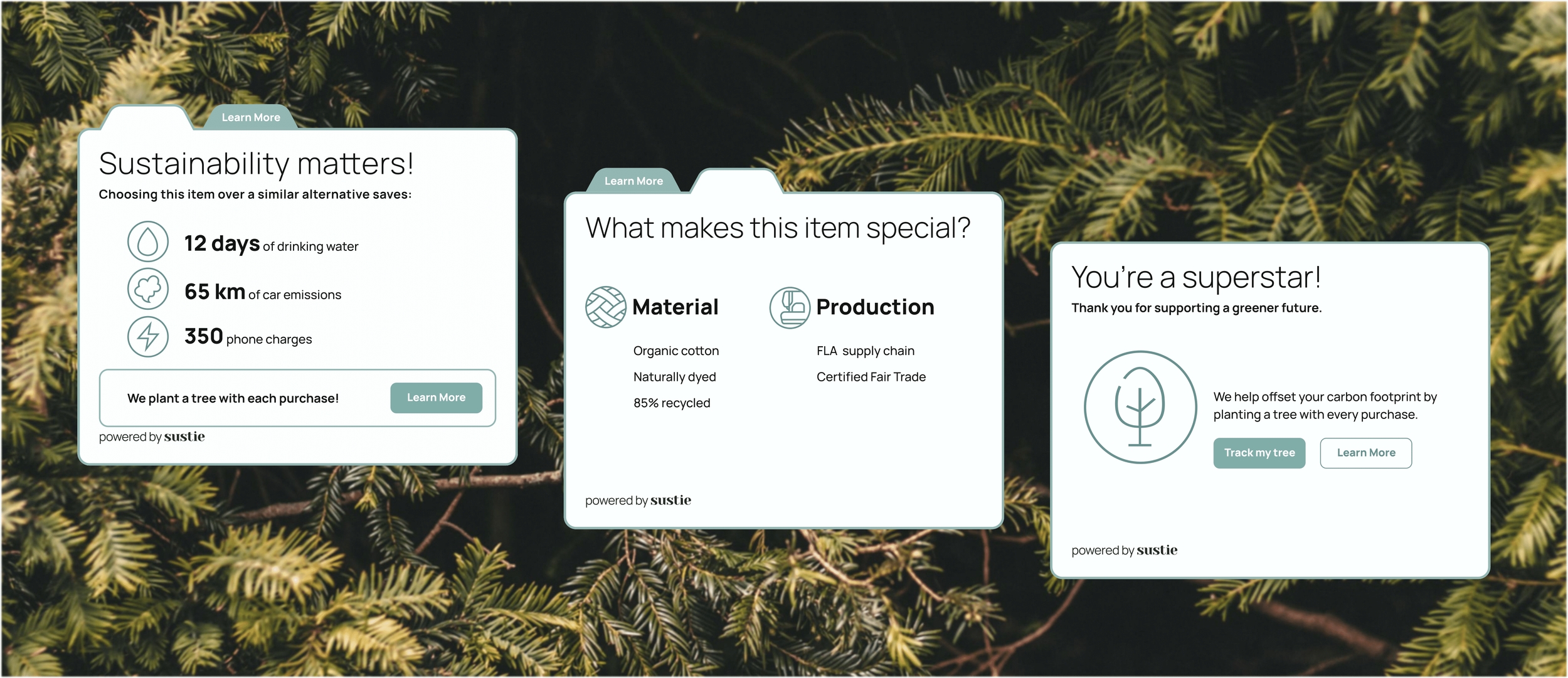
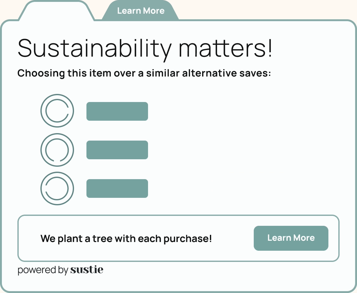
Revised design


Tabbed design for easier display of information
Neutral gray color suits a wide variety of e-commerce contexts
Updated visual hierarchy brings sustainability metrics into focus
Pared down illustrations attract the eye.
“Learn more” CTAs encourage users to investigate the claims, increasing trust.

What Did We Learn?
Measuring Success
Shortly after the IDP team finished our project, Sustie changed owners, and as of right now is no longer online. Therefore, we never got to see our work implemented.
So, how do we determine the success of our project?
Most of Sustie’s partner companies no longer feature the widget on their product pages, but a few feature something similar. So what benefits do these sustainability metrics provide?
Competitor company Greenstory estimates a 400% increase in growth and customer loyalty for brands using its Digital Product Passports.
Sustie, prior to our project, gave the more modest estimation of a 7-20% increase in conversions.
If our redesign of the widget caused even a 5% increase in conversions for companies who use Sustie’s product, I would consider our work a success from the business end.
Regardless, the opportunity to learn in a real world, collaborative environment was valuable to the entire IDP team.
Next steps
Looking at Greenstory again, a key aspect of their Product Passports is flexibility. They can display a variety of information in a variety of ways.
Though our widget is designed for use in both desktop and mobile product pages, I would like to see it expanded for use in even more contexts.
What if a client only wants to display sustainability metrics without the carbon offset perks, or vice-versa? This would require further testing and work from the design team.
To measure the success of our work, and Sustie’s product on the whole, we would need to collect and analyze more data in the form of user interviews, A/B testing, and site metrics.